Why Video Editing Matters on a Website
Pace, format, weight and subtitles: why editing decides whether a video works on a website, and how to embed it without wrecking performance.
Read moreGrid, typography, contrast and hierarchy: the graphic design principles that make a business website readable, credible and, in the end, genuinely profitable.
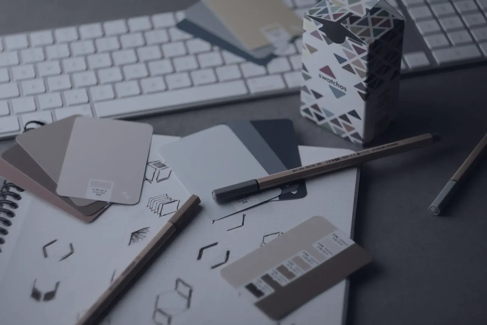
Photo Andy Brown on Unsplash
Graphic design for a website is not a coat of aesthetics applied at the end. It is the system that decides what a visitor sees first, what they understand in three seconds, and what they do next. A site can be beautiful and unreadable; it can be plain and ruthlessly effective.
On a screen, the eye does not read, it scans. The designer’s job is to build a slope the gaze slides down naturally. That takes only three tools : size, contrast and space. A heading twice the size of everything else, a button in a colour used nowhere else, and emptiness around what matters are enough to guide any visitor.
A trilingual site is not designed in French and then "translated". Arabic reads right to left: navigation, arrows, progress indicators and directional icons must flip. Elegant Latin typefaces have no automatic Arabic counterpart : you pick a compatible Arabic family, usually taller, and recalibrate the sizes. Arabic copy also runs 15% to 25% shorter than French, so layouts calibrated on French alone fall out of balance.
A professional site runs on one neutral dominant colour, one accent reserved for actions, and two or three greys. The accent should appear only where you want a click. The moment it also decorates a heading or a border, it loses its pulling power. Check contrast systematically: 4.5:1 minimum for body text, 3:1 for large headings.
Successful web design is rarely noticed. What the visitor notices is that they found what they came for without effort : and that is precisely the outcome of invisible but rigorous design work.
Pace, format, weight and subtitles: why editing decides whether a video works on a website, and how to embed it without wrecking performance.
Read more
Visual processing, memory and cognitive load: why an image works faster than any sentence, and how to turn that head start into conversions on your website.
Read more
The three reasons to build an e-commerce site: sell without intermediaries, take back control of your margins, and turn a buyer into a loyal customer.
Read moreLet's talk. We reply within 24 h, with a free quote and no strings attached.